Level 3 : Working with Photographs

Tutorial 3-1 Introduction to Exposure
Tutorial 3-2 Correcting Image Exposure
Tutorial 3-3 The Basics of Color
Tutorial 3-4 Correcting Image Color
Tutorial 3-5 Increasing Sharpness
Tutorial 3-6 From Color to Black and White
Tutorial 3-7 Resizing and Cropping
Tutorial 3-8 Images for the Internet and Email
Tutorial 3-9 Correcting Lens Distortion
Tutorial 3-10 Adding a Soft Focus Effect
Tutorial 3-11 High Dynamic Range Images
Tutorial 3-12 Creating Panorama Compositions
Tutorial 3-13 Hand Coloring a B&W Photo

3-3 : The Basics of Color

Intro
There is a big difference between how your eye sees color and how your camera sees color. Your eye will look at a scene and recognize objects and somehow your brain figures what objects are what color. But if you look at a white sheet of paper, even under colored or artificial light, your brain tells you that the paper is while because that is the color is should be. Your camera will look at the same piece of paper and if your light is slightly yellow (due to incandescent light), it will record the paper as slightly yellow because it doesn't know what color it should be. What this means is that your camera will not always record the color that you expect or want to have in the final image.

Also, your eye is a remarkable piece of optic equipment. It can view many levels of light and a near infinite number of colors. This is something that film and digital sensors can't do (yet). Digital imagery is made of combinations of red, green and blue light (RGB) that are used in combinations to reproduce a wide range of colors.

This tutorial will explain the basics of color to help you understand how to make better looking photos.

RGB
The basics of digital images are electronic. Without getting too technical, that means that computers need to take a real world subject (for example, the colors of a sunset) and turn it into 1's and 0's in a digital world. It does this by converting it to various levels of Red Green and Blue and mixing different combinations of the 3 colors. Red, Green and Blue are the building blocks of all colors. When you look at a computer screen you are looking at rows of pixels that contain the 3 colors. Below is a photo of my laptop screen with an are enlarged so that you can see the pixels in action.

RGB Monitor

See how there is pattern of pixels in the enlarged area? Up close, the screen is just a bunch of dots, but the further back you go, the better it looks. This is how the real world can be represented in a digital world.

Now that you've seen how a monitor looks at color, I'll show you how a digital image uses Channels to create an image. Each image uses a Red channel, a Blue channel and Green channel. When these are combined, you get a multicolor image with subtle tones and colors. If you look at the image below, you'll see the full image (RGB) followed by the Red channel. This section shows you just what is considered 'red' by the image. Where the full image is most red, the red channel will be lighter - where there is less red, it will be darker. Look at all 3 channels and see where the light and dark areas correspond to the full RGB image.

RGB Image

At the bottom you'll see what the maximum value of each color looks like and at the bottom left, you can see the combined maximum of Red, Green and Blue at 255,255,255 - which equals white. Minimum values (0,0,0) would give you black.

So how does this boring theory part of the tutorial help you become a better Photoshop user? Easy, you need to understand how color interacts when manipulating images. But wait, there's more!

Opposite don't attract
According to Physics 101, for each action there is an equal and opposite re-action. Since light follows the rules of physics, it's true in Photoshop as well. Each of the basic RGB colors (Red, Blue and Green) have opposites, CMY (Cyan, Magenta, and Yellow). This is easier explained by looking at a color chart that shows how these colors interact.

Colors

So if you combine red and blue (overlapped in the image above) you get magenta. Magenta is the opposite of green. Look at the other combinations as well. What this means is that if you add more green to your image, you are actually taking away magenta. Ok, you're ready to see how this works in photoshop.

When adjusting colors in Photoshop, one way is to to use the Color Balance dialog box. It uses sliders to control colors. After reading all this boring theory, the image below should make sense to you.

Color Balance Dialog Box

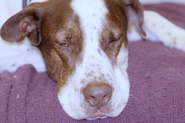
So now can see that if you have an image that looks too yellow (due to interior lighting), you can correct it with the color sliders by moving the yellow/blue slider to the right and adding more blue.

White Balance
Many new digital cameras and all high-end ones have some kind of 'White Balance". This is more a camera setting so I don't want to get into it too much, but I'll explain how it affects your photos. Cameras try to expose a scene as though it is a neutral 18% gray. That means that it will base the exposure and color on that assumption. Light comes in a wide array of temperatures from cool (blue) to warm (orange) and the camera will try to compensate for it. You will want to make sure that your images are taken with the White Balance as close to the correct setting so that you are left with minimal adjusting. Most cameras have an Auto White Balance and will try to calculate the most accurate settings, but this doesn't always give you the best results.

Below is a photo of my dog, Buck, taken on the wrong white balance setting. It's made him 'blue'. If you more your mouse over the image, you'll see the correct colors from the photo taken with the correct white balance setting.

White Balance example

Some cameras handle white balance better than others. Some give the user more control. Still, white balance is one of the leading causes of 'wrong color syndrome'.

CMYK
You may have also heard of the CMYK color system. This stands for Cyan, Magenta, Yellow and Black. Please don't ask me why "K" stands for "Black". This is a common system used in printing as the 3 colors will also combine to make most others, and the black will add a rich, dark black to the mix - especially for text. It's also known as process color and we'll deal with it later. Your printer might have different cartridges for each of these colors

The next lesson will teach you the methods behind color correction and making your photos look their best. If you combine color AND exposure correction, you'll have a great image. You'll even see how some techniques can fix both at once.

In the third level, you'll learn other color concepts for working with graphic designs.


Conclusion
A basic understanding of color is needed so that you can work with images and achieve great results. Most importantly you should develop an eye for what correction are needed. In a photo lab, a good printer operator will see what's needed and make the corrections with a minimum of testing. Learning how to correct photos for accurate color relies on this skill. I apologize in advance to all color blind people. Also, having a Calibrated Monitor helps you get great color for people who view your images on other computers and when you send photos off to be printed.

Reference
CMYK color information on Wikipedia
RGB color information also on Wikipedia
Read about White Balance
Read about Color Temperature

The video content presented here requires JavaScript to be enabled and the latest version of the Adobe Flash Player. If you are using a browser with JavaScript disabled please enable it now. Otherwise, please update your version of the free Adobe Flash Player by downloading here.


<< Previous Tutorial

Return to List

Next Tutorial >>

Owned and operated by The Art Department, Chester, NE
This web site is protected by Copyright 2008 - 2017 ©

Last Update:


Please visit our other sites:

| www.myARTdepartment.com | www.TheCenterofCreativity.com | CustomGamingDesign.com | FreeAutoCADTutorials.com |

myIllustratorsite.com | myAfterEffectssite.com | myAutoCADsite.com