4-3 : Designing a LogoWhat is a Logo? You also have to consider where that logo will be used. Think websites, letterhead, clothing (printed and embroidered), magazines, imprinted on the product, and much more. Your logo should be simple enough to be used in these different ways. It should also look good in black and white or color. It needs to look good whether it is large or small. When I am starting a project for a new company, I always start with the logo. I do this because the logo will set the tone for the rest of company's image. I will make a logo that fits that image (corporate, fun, zany, tech, etc). I will use the color from the logo for the website layout and signage. So for me, the logo is the keystone of any corporate identity. I recommend taking this approach, especially if you are working with a client - if they like the logo, they'll like the rest of the package. So spend a lot of time on a logo, get it right, and use your vision to see it in many uses.
What image does this company name bring to mind? THAT's Right! A Pit bull No, I mean a Bulldog! So this is where we will start. We need to draw or find clipart of a bull dog...but since their budget is small, and you don't need to learn how to draw in Photoshop right now, we will find clipart. There are many sites out there that are very reasonable and have an excellent variety of styles and subjects, of royalty free images. (We'll talk more about "Royalty Free" images later)
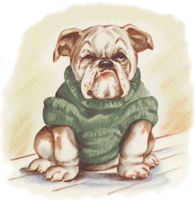
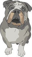
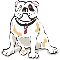
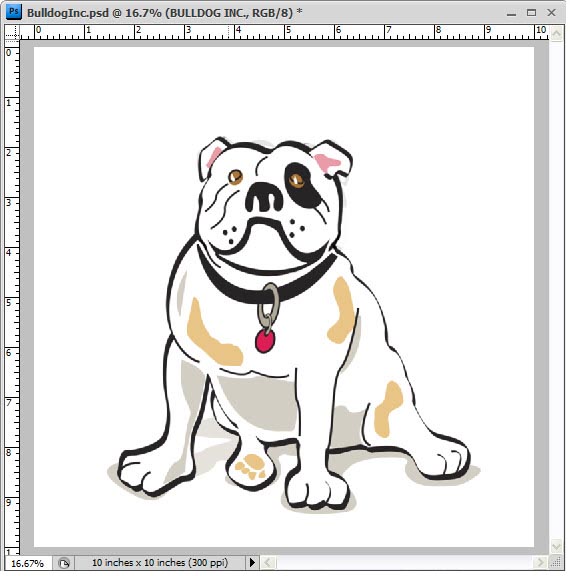
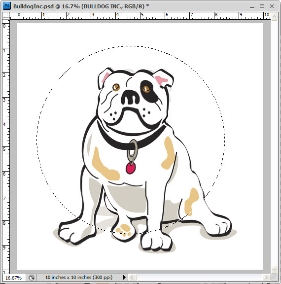
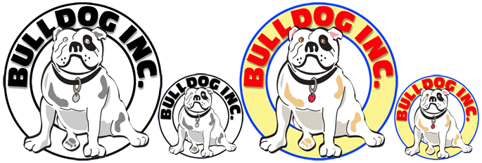
Here's a muttly crew of bulldogs! Which one would you use or not use? If I were picking graphics for a story book about Rufus the Bulldog, I would certainly chose the first one on the left. Though I really like the guy in the middle, I don't care for his coloring. But we can change this in PS (Tutorial 1-6). The bulldog on the end has a lot of potential, especially since I found many poses of the same dog, which will come in very handy when we animate him. He also has great coloring for a fun and playful logo. We'll use him! Always start big then reduce to the correct size- since he will be using our logo for many things, we'd want to make him about 10" x 10" at 300 DPI. (Keep the final size in mind when downloading clipart images) This size will cover things from T-shirts to business cards.
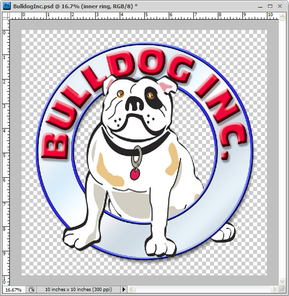
Let's open a new workspace, navigate to "New" (Ctrl +N) from the "File" drop down menu. Make it 10"x10" and 300 DPI. You can give it a color or transparent background, it really doesn't matter since we'll be working in layers anyway. I prefer to work in RGB especially since I'll be using this image mainly on the internet (you can change it later when you go to print with it). To review the differences between RGB & CMYK, refer to Tutorials 3-3 and "Saving Files for Print" in 2-10. Open your bulldog file in another window and "Select All" then "Copy" and with the new workspace or page active, "Paste" (or Ctrl+A, Ctrl +C, change to new workspace and Ctrl +V) Now that you have a copy of your bulldog in a new layer on the page, we need to think about text. Bulldog, Inc. This logo should be fun and bouncy because they make bouncy basketballs and basketballs are fun! AND because basketballs are round, let's make our logo round too. Before we go any further, lets resize the bulldog image to fit within the space... you'll use the "Transform Tool" (Tutorial 1-15)
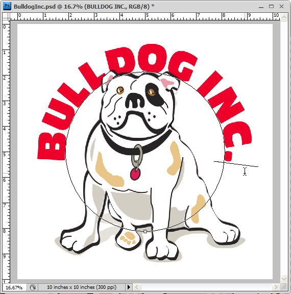
To add text to the logo that follows a circular path... using the "Elliptical Marquee" (Tutorial 1-3) we will make a circle by clicking the middle and dragging towards the outside while holding the "Alt & Shift" keys to set the pivot point where we clicked, and then constrain the ellipse to a circle. We will turn this "Selection" into a "Path" on which we will type our text. With the selection active, "Right Click" on the workspace and chose "Make Work Path" from the drop down menu. A tolerance level box will open, just say "OK" to except the default. Now that we have a path we can added text to it. (Tutorial 1-12)
With your "Text Tool" active, click on the path (watch for the cursor to change) and start typing. It works just like the standard text tool except it will follow the path (and that path can be any shape, for future reference.) Keep in mind that where you click on the path will be the set point of your text. You can make that your center, right justify, or left justify in the "Text Options" box. You can also move the set point by clicking on it and holding down the "Ctrl" key while you drag it to where you want it to be (this can be tricky). You'll be able to bring the text inside the circle path or drag it to the top or bottom. You should play with this a bit and get a feel for what it does.
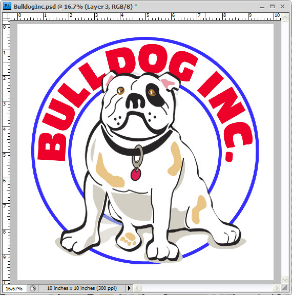
Adjust your text position on the path, pick a font that you like, resize the point size of the text to fit the space, give it a color and you're done, with that part (Tutorial 1-12). If your text isn't centered, you can rotate it (CTRL+T). To position the text within the workspace, use the "Move Tool" (Tutorial 1-5). You can also adjust the size, making it bigger or smaller to fit better as well (Tutorial 1-15). You should get it into position before we start the next step... Which is to add a circle banner around it. Using the "Elliptical Marquee" in the same manner as before, I made a circle that was a little smaller than the text path and gave it a 30pt stroke of blue by "Right Clicking" on it and selecting "Stroke" from the drop down menu. Make sure that you add this to a new layer so that it doesn't become part of our bulldog layer or some other layer- you'll want to be able to move it or change it independently of the other layers. Do the same thing for the outside ring as well. So now you should have 3 new layers, one for each of the blue rings and one for the text.
Let's make sure that we got these elements centered on each other by selecting the 3 layer in the "Layers Palette" (Tutorial 1-16) and with the "Move Tool" activated, select the "Align Horizontal Center" icon in the "Menu Bar"
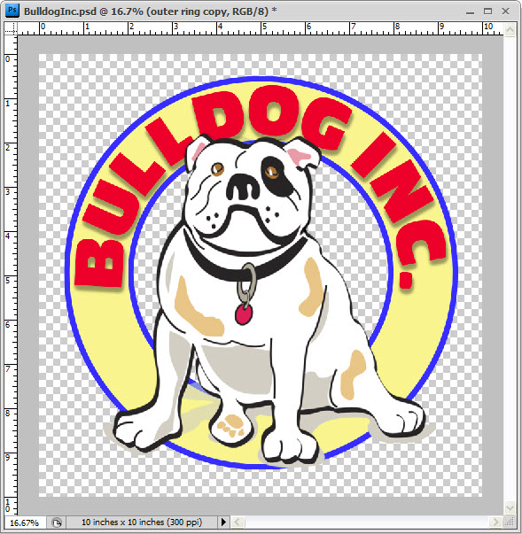
Now with just the two circle layers selected, "Align Vertical Center". If things don't line up as expected, and can always visually adjust their placement by hand. You'll might notice that the text is not aligned vertically, for example. Well, the logo is looking pretty good and we could stop here if we wanted to... but we won't. Let's give it some depth by adding a "Drop Shadow" to the text, filling the space between the blue lines with a color, maybe add a shadow or bevel to that... Adding the "Drop Shadow" to the text is the easy part, "Select" the text layer in the "Layers Palette" window, "Right Click" on the layer, select "Blending Options" from the drop down menu, and add a "Shadow" (Tutorial 2-2). The first thing to do, would be to add a "New Layer" so that you can easily change it later if you chose to. Filling the inside of the banner with a color is a little tricky, and in typical PS fashion, can be done in several different ways. The way that we are going to do this is to select both circle layers in the "Layers Palette" window and "Duplicate" them by right clicking and selecting that option from the drop down menu (Tutorial 2-1). With them active, right click again and select "Merge", you now have one layer with both blue circles on it, AND you have the two original layers as well. With the new layer active, click in the area that you want to add color using the "Magic Wand Tool" this will select just the band. In the "Layers Palette" activate the new layer that you made and fill it with color (Tutorial 1-8).
You should have something that looks like this above (Make sure to save this project as a PS file so you have the layers to change at a later date if the client doesn't care for the color yellow or you want to use it in Tutorial 4-6). For the banner fill, I chose a lighter variation of the colors in the bulldogs spots so that the colors would be compatible. I also could have added a bevel to the text or blue strokes, maybe a drop shadow to the banner. I could have used a mask and moved his back legs behind the banner so it looked like he was sitting in it, or add a gradient fill to make it look like chrome... Really the options are endless and can all be made easily using the "Blending Options Palette". So what would you do with it!
Conclusion Reference |
|||
<< Previous Tutorial |
Return to List |
Next Tutorial >> |
|
|
|||
Owned and operated by The Art Department, Chester, NE |
Last Update: |